How Does Color Psychology Affect Web Design?
In today’s fast-paced digital world, the success of a website hinges not just on its performance and content but also on its overall visual presentation. Web design has come a long way, evolving from basic, text-heavy layouts to engaging and dynamic platforms that resonate with diverse user preferences and expectations. At the heart of this evolution is the strategic use of color, a crucial element that shapes the user experience.
Color psychology, the study of how colors affect human emotions and behaviors, plays a significant role in modern web design. In this blog post, we’ll explore the impact of color psychology on web design and offer expert advice on how to choose the perfect color palette for your website.

Exploring the Impact of Colour Psychology
Colour psychology is a specialized area of psychology that explores the influence of various colours on human emotions, thoughts, and actions. It’s an intriguing discipline that plays a significant role in numerous areas of life, such as branding, marketing, interior design, and even website development.
In web design, the principles of colour psychology are applied to craft visually appealing websites that also meet functional goals. Each colour has the power to trigger distinct emotional reactions, and grasping these reactions is key to designing websites that truly connect with their audience.
The Influence of Colors on Human Emotions and Behavior
Colors play a significant role in shaping emotions and behavior. Here’s how different colors can affect the experience of visitors on your website:
Red
Red is a vibrant, energetic color linked with passion, excitement, and urgency. It’s highly effective at capturing attention and motivating users to act. For instance, many e-commerce sites leverage red for “Buy Now” buttons to prompt immediate purchasing decisions.
Blue
Blue is commonly connected with trust, dependability, and calmness. It’s a go-to color for corporate websites and social media platforms. Soft blues tend to evoke a sense of peace, while deeper blues exude professionalism and stability.
Green
Green is frequently associated with nature, health, and growth. This color is ideal for communicating themes of eco-consciousness, relaxation, and renewal. It’s widely used by health and wellness websites to inspire feelings of trust and tranquility.
Yellow
Yellow is bright, joyful, and promotes feelings of positivity and happiness. It can be utilized to attract attention and encourage optimism. However, overuse of yellow can become overwhelming, so it’s best applied in moderation.

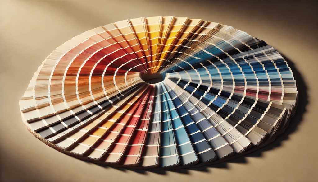
Selecting the Ideal Color Schemes
Now that we’ve explored how colors can shape emotions and influence behavior, it’s time to focus on choosing the perfect color schemes for your website. Here are some practical tips to guide your decision-making process:
Understand Your Audience: A deep understanding of your target audience is critical. Colors can carry different meanings across demographics and cultural backgrounds. Conduct surveys or research to discover which colors resonate most with your audience and align with your industry.
Maintain Brand Consistency: If your website reflects a brand, it’s important that the color scheme aligns with the brand’s identity. Consistent branding fosters trust and helps users recognize your business. Think of Coca-Cola, which is instantly recognized by its iconic red and white palette.
Consider Emotional Reactions: Reflect on the emotions you want to evoke in your visitors. For instance, if you’re aiming to build trust, shades of blue may be effective. If you want to inspire action, vibrant tones like red or orange might work better.
Balance and Contrast: An effective design typically uses a mix of colors that create balance and contrast, making the site both visually appealing and easy to navigate. Utilize tools like color wheels to identify complementary colors that enhance the overall aesthetic.
Test and Refine: Web design is an ongoing process, so it’s vital to test your color choices and gather user feedback. A/B testing can help you identify which color schemes are most effective in achieving your objectives.
Ensure Accessibility: Make sure your color scheme is accessible to all users, including those with visual impairments. Use high-contrast color combinations, and consider features like alternative text and other accessibility enhancements to create a user-friendly experience for everyone.

Case Studies: Unleashing the Power of Color in Web Design
Let’s dive into some examples of websites that brilliantly utilize color psychology to enhance user engagement and meet their business objectives.
Airbnb
Airbnb’s platform primarily features a calming shade of blue that evokes trust and reliability. This consistent use of color aligns with their brand identity and reassures users as they search for accommodations. Green is strategically placed on call-to-action buttons to encourage bookings, complementing the site’s overall intuitive and user-friendly design.
McDonald’s
McDonald’s taps into the energetic combination of red and yellow, colors that stimulate excitement and enthusiasm. These hues are known to trigger hunger and prompt quick action, perfectly aligning with the fast-food industry’s emphasis on speedy service and satisfying cravings.
Patagonia
Patagonia, a brand synonymous with environmental responsibility, incorporates natural greens and blues throughout its web design. These colors effectively reflect their eco-conscious values, creating a sense of nature that resonates deeply with their audience and reinforces their commitment to sustainability.
Apple
Apple’s website is a masterclass in minimalism and modernity, characterized by its predominant use of black and white. This sleek color palette conveys elegance, sophistication, and simplicity, perfectly mirroring the brand’s identity and its line of premium, high-end products.
Conclusion
Color psychology is a powerful tool in web design that significantly impacts how users perceive and interact with a website. By understanding the emotional responses that different colors evoke, designers can create websites that resonate with the target audience, enhance user engagement, and drive desired actions. The right color scheme goes beyond aesthetics—it communicates a brand’s values, builds trust, and sets the tone for the overall user experience.
Whether it’s the urgency and excitement of red, the trust and calm of blue, or the optimism of yellow, each color has a distinct role in shaping user behavior. A strategic approach to color selection, combined with regular testing and refinement, ensures that the design not only looks good but also performs effectively. In an increasingly competitive digital landscape, mastering the principles of color psychology can be the key to a website’s success.
FAQs
How does color psychology influence web design?
Color psychology affects how users feel and behave on a website. By leveraging specific colors, web designers can evoke certain emotions, build trust, and encourage actions such as making a purchase or exploring more content.
What colors are best for e-commerce websites?
For e-commerce sites, red is often used for call-to-action buttons like “Buy Now” as it evokes urgency and excitement. Blue is another popular choice, as it fosters trust and reliability, while yellow can attract attention and create a sense of optimism.
How can I ensure my website’s color scheme is accessible?
To ensure accessibility, use high-contrast color combinations that are easily distinguishable for users with visual impairments. Additionally, incorporate features like alternative text for images and ensure that key elements such as buttons are clearly visible.
How do I choose the right colors for my brand’s website?
Start by understanding your target audience and the emotions you want to evoke. It’s essential to maintain consistency with your brand’s existing colors and values, and test different color combinations to see which ones resonate best with your audience.
Can color choices really affect conversions and user actions?
Yes, color choices can significantly affect conversions and user actions. For example, red and orange are known to prompt immediate action, while blue can build trust, encouraging users to explore or make a purchase. Testing different color schemes can help optimize these effects.