What Is The Grid System In Web Design
Grid design is a cornerstone of modern web design, providing a systematic and visually harmonious way to organize content on a website. For businesses with websites, adopting a grid design offers numerous advantages, ranging from improved user experience to streamlined development processes. In this guide, we’ll explore the benefits of grid design specifically for businesses, helping you understand how it can elevate your online presence.

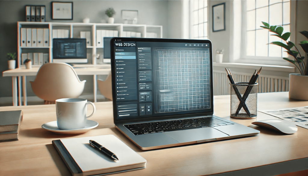
What Is a Grid in Web Design?
In web design, a grid is an invisible framework of intersecting rows and columns that guides the placement of elements on a webpage. This structure ensures that content is organized and visually aligned, creating a cohesive layout. Grids can be fixed, fluid, or responsive, adapting to the needs of various screen sizes and devices. For businesses, grids are not just a design choice but a functional tool to achieve a professional and user-friendly website.
Why Businesses Should Use Grid Design
For businesses, a well-designed website is critical for attracting and retaining customers. Grid systems offer several benefits that directly contribute to achieving business goals:
- Professional Appearance Grids ensure that your website looks polished and organized. By aligning elements consistently, a grid design communicates professionalism, which can instill trust in your audience.
- Enhanced User Experience A grid’s structured layout makes it easier for visitors to navigate your website. Clear alignment and spacing help users find information quickly, reducing frustration and improving their overall experience.
- Faster Development and Maintenance Grid-based layouts streamline the design and development process. Pre-defined frameworks and reusable components save time for developers, allowing businesses to launch and update their websites more efficiently.
- Responsive Design With the increasing use of mobile devices, a responsive website is essential. Grid systems facilitate responsive design, ensuring your website adapts seamlessly to various screen sizes and devices.
- Improved Content Hierarchy Grids help businesses prioritize content by creating a visual hierarchy. Important information, such as calls to action or product highlights, can be strategically placed to capture attention.

Components of a Grid System
Understanding the components of a grid system is essential for businesses aiming to leverage its benefits. Here are the key elements:
- Columns: Columns are vertical sections within a grid. They organize content and provide a framework for aligning elements. For example, a 12-column grid is a popular choice for creating flexible layouts.
- Gutters: Gutters are the spaces between columns or rows. They prevent clutter and enhance readability by providing breathing room around content.
- Margins: Margins are the outer boundaries of a grid. They ensure that content doesn’t feel cramped and maintain a balanced appearance on the page.
- Units: Units are the smallest building blocks of a grid, defining the dimensions of individual sections. Designers use these units to position and size content accurately.
- Breakpoints: Breakpoints are specific points where a grid’s layout adjusts to fit different screen sizes. They are critical for ensuring a responsive and user-friendly experience.
How Grid Design Benefits Business Websites
Grid design directly impacts various aspects of a business website. Let’s explore these benefits in detail:
1. Consistent Branding
A grid system helps maintain a consistent design across your website, reinforcing your brand identity. Consistent fonts, colors, and layouts create a cohesive experience that strengthens brand recognition.
2. Better SEO Performance
Search engines favor well-structured websites. Grids contribute to clean and organized code, which can improve your website’s search engine optimization (SEO) performance. Additionally, responsive grid systems ensure mobile-friendliness, another critical factor for SEO.
3. Increased Conversions
By enhancing visual hierarchy, grids make it easier to highlight calls to action, promotions, or key services. This strategic placement can guide users toward desired actions, such as making a purchase or filling out a contact form.
4. Scalability for Future Growth
As your business grows, your website needs to accommodate new content and features. Grid systems provide a scalable framework that simplifies adding new elements without disrupting the overall layout.
5. Accessibility Compliance
Grids support accessibility by creating a predictable and navigable structure. This ensures that users with disabilities can interact with your website effectively, improving inclusivity and compliance with accessibility standards.

Implementing Grid Design for Business Websites
Step 1: Identify Your Website Goals: Before implementing a grid system, define your website’s objectives. Are you focusing on e-commerce, lead generation, or brand awareness? Understanding your goals will guide your grid design decisions.
Step 2: Choose the Right Grid System Select a grid system that aligns with your business needs. Common options include:
- Fixed Grids: Best for designs targeting specific screen sizes.
- Fluid Grids: Adapt to screen sizes proportionally.
- Responsive Grids: Combine fixed and fluid properties for maximum flexibility.
Step 3: Prioritize Content: Organize content based on its importance. Place critical information, such as product descriptions or testimonials, in prominent positions within the grid.
Step 4: Test and Optimize: Once your grid design is implemented, test it on various devices to ensure responsiveness. Gather user feedback and make adjustments to enhance usability and engagement.
Real-Life Examples of Grid Design Success
Example 1: E-commerce Website: An online store implemented a 12-column grid to showcase products in a visually appealing way. The grid’s responsiveness ensured a seamless shopping experience on mobile devices, resulting in a 25% increase in sales.
Example 2: Corporate Website: A B2B company used a modular grid to organize case studies, services, and contact information. The clean layout improved navigation, leading to a 40% increase in inquiries.
Best Practices for Using Grids in Business Websites
1. Keep It Simple
Avoid overloading your grid with excessive columns or elements. A clean and straightforward layout enhances readability.
2. Use Whitespace Effectively
Whitespace is crucial for creating a balanced design. It allows your content to breathe and prevents visual clutter.
3. Test Across Devices
Ensure your grid performs well on all screen sizes. Responsive grids are essential for providing a consistent experience.
4. Align Content Strategically
Place high-priority content, such as headlines and calls to action, in prominent positions within the grid.
5. Optimize for Speed
Ensure your grid-based design doesn’t compromise website loading speed. Optimize images and use efficient coding practices.
Conclusion
Grid design is a powerful tool for businesses seeking to create impactful websites. By organizing content systematically, grids enhance visual appeal, usability, and functionality. The benefits of grid systems extend beyond aesthetics, driving improved user experiences, higher SEO rankings, and increased conversion rates. Moreover, adopting a grid-based approach ensures scalability, allowing your website to grow seamlessly with your business needs.
For businesses looking to elevate their online presence, partnering with professionals can make all the difference. Eclipse Marketing, a digital marketing agency, specializes in web design services. With expertise in creating grid-based websites, Eclipse Marketing can help your business stand out with a polished, user-friendly design that aligns with your brand’s goals. Invest in a grid system today and watch your website transform into a powerful asset for your business’s success.
FAQs
What is the main purpose of a grid system in web design?
The main purpose of a grid system is to create a structured and visually consistent layout that enhances usability and design harmony. It ensures content is organized and adapts seamlessly to different screen sizes.
How does a grid system improve user experience?
A grid system improves user experience by providing clear alignment and spacing, making it easier for users to navigate a website and find the information they need quickly.
What types of grid systems are commonly used in web design?
Common grid systems include fixed grids (targeting specific screen sizes), fluid grids (adapting proportionally to screen sizes), and responsive grids (combining fixed and fluid properties for maximum flexibility).
Can grid systems help with SEO?
Yes, grid systems contribute to clean and organized code, which search engines favor. Additionally, responsive grid systems ensure mobile-friendliness, a critical factor for SEO performance.
Why should businesses consider using grid systems for scalability?
Grid systems provide a flexible framework that simplifies adding new content or features as a business grows, ensuring a cohesive design without disrupting the website’s layout.
Users Also Say
User 1:
“At its core, it organizes your content by aligning it with vertical guidelines, ensuring equal spacing between all elements. This approach keeps everything tidy and visually appealing.
The grid systems you encounter essentially assign a class like “span-2” (or whatever naming style the framework follows) to an element. In the grid’s CSS, it defines something like .span-2 { width: 200px; margin-right: 20px; }. The width specifies how many columns the element spans, while the margin sets the consistent “gutter” space between columns.
Try experimenting with a few systems. A good starting point is 960.gs, as it’s straightforward and supported by numerous online resources.”
User 2:
“As a university freshman studying web development, I sometimes feel like relying on grid systems is almost like taking a shortcut since they come pre-configured with well-balanced properties.
Why do I think this way?”