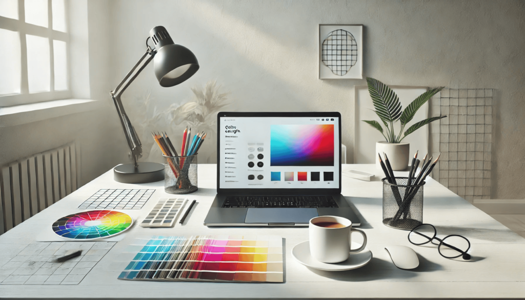
How To Choose Color For Web Design
Choosing the right colors is a critical aspect of designing a website that can either elevate its impact or hinder its success. In this guide, we’ll delve into the basics of color theory and psychology and walk you through a step-by-step process to create effective color palettes tailored for business websites.
Struggling to find the perfect color combinations for your business website? You’re not alone. While selecting colors might appear straightforward, there’s a science and strategy behind creating palettes that resonate with your audience and support your business goals. Everyone has personal preferences when it comes to colors—some may adore vivid shades like cherry red or neon green, while others prefer calming pastels. The key challenge for businesses is to move beyond personal biases and focus on selecting colors that align with their brand identity and target audience.
Thankfully, there are proven principles and techniques that simplify the process of choosing the right colors for your website. In this guide, we’ll help you take the guesswork out of color selection. First, we’ll explore the essential principles of color theory and psychology that every business owner should understand. Then, we’ll outline a simple three-step process to craft a professional and cohesive color palette for your website that engages visitors and drives results.

Why the Right Colors Matter in Web Design
Ever wondered if choosing the right colors for your website really makes a difference? The answer is a definitive yes. Selecting the right colors is crucial for enhancing readability, visual appeal, and brand identity. On the flip side, poor color choices can lead to a frustrating user experience—and for a business website, that’s a risk you can’t afford to take.
Enhancing Readability
Color plays a significant role in determining how easily users can read your content. Readability improves when there’s an optimal level of contrast between text and background colors. Too little contrast makes the text difficult to decipher, while excessive contrast can strain the eyes. For example, black text on a white background is a go-to choice for clarity. However, many websites prefer dark gray text on white or off-white backgrounds to maintain legibility while reducing eye fatigue.
Creating Visual Harmony
Visual appeal in web design isn’t about personal preferences; it’s about crafting harmonious color schemes that look inviting and professional. This involves understanding the principles of color theory. Three widely appreciated color schemes—monochromatic, complementary, and analogous—can be leveraged to create cohesive designs. By mastering these schemes, web designers can effortlessly select colors that enhance the overall user experience.
Strengthening Brand Identity
Colors are also pivotal in establishing brand recognition. Many successful brands rely on signature colors that dominate their websites, marketing materials, and other branding elements. Think of Coca-Cola’s vibrant red, Starbucks’ iconic green, or Ikea’s bold blue and yellow combination. Consistency in color usage helps reinforce brand identity and make it memorable. Furthermore, the psychology of colors can guide businesses in selecting primary brand hues that evoke specific emotions and resonate with their audience.
By prioritizing the right colors, your website can achieve a winning combination of readability, aesthetics, and branding, ensuring a positive and lasting impression on visitors.

Mastering the Art of Color Selection with Color Theory
Color theory serves as a powerful tool for crafting harmonious and visually appealing color combinations. At its core lies the color wheel, a visual guide that illustrates the relationships between primary, secondary, and tertiary colors. The wheel also categorizes colors into warm and cool tones, providing a structured approach to understanding their interplay. By mastering the basics of the color wheel, you can begin to select colors that complement each other effortlessly.
Exploring Color Schemes
A color scheme refers to a thoughtfully curated combination of colors designed to work well together. Designers commonly use three primary types of color schemes: monochromatic, complementary, and analogous. These schemes act as blueprints for selecting colors that align with a project’s goals. Let’s dive deeper into each.
Monochromatic: Simplicity in Unity
Monochromatic schemes revolve around a single hue—be it red, yellow, or blue—along with its tints, shades, and tones. For instance, choosing blue as your base allows you to explore lighter or darker variations to create a cohesive palette. While monochromatic colors are visually soothing, maintaining sufficient contrast is key to ensuring readability and aesthetic balance.
Complementary: The Power of Contrast
Complementary schemes pair colors that are directly opposite each other on the color wheel, such as red and green or blue and orange. These combinations create a striking contrast, making them ideal for grabbing attention in web design or branding. However, the boldness of complementary colors requires careful usage to avoid overwhelming your audience.
Analogous: Natural Harmony
Analogous color schemes feature colors that are adjacent on the color wheel, such as yellow, yellow-green, and green. These palettes exude a natural sense of harmony, making them perfect for designs that aim to be visually pleasing. To enhance legibility, consider pairing analogous colors with neutral tones like white or black for a polished look.
Bridging the Gap with Color Psychology
As you grow comfortable with the principles of color theory, selecting harmonious palettes becomes a more intuitive process. The challenge lies in determining which scheme suits your project and how to incorporate specific sections of the color wheel effectively. This is where color psychology takes center stage, helping you align your color choices with the emotions and responses you wish to evoke.
By understanding and applying these principles, you can create designs that not only look beautiful but also resonate deeply with your audience.

Mastering the Art of Color Psychology in Design
While color theory emphasizes creating visually pleasing color schemes, color psychology delves into how different hues impact human emotions and behaviors. At first glance, emotions may seem irrelevant in business settings, but they’re integral to branding, marketing, and sales strategies. Consumer decisions are often emotionally driven, making color psychology a powerful tool in shaping perceptions and driving actions.
Decoding Color Meanings
Applying color psychology to website design involves understanding the emotional and cultural associations tied to colors. Colors trigger subconscious feelings influenced by individual experiences and cultural norms. Here’s a breakdown of commonly associated meanings:
- Red: Passion, energy, love, excitement, danger
- Blue: Trust, calmness, peace, logic, reliability
- Green: Nature, health, abundance, prosperity
- Yellow: Optimism, happiness, creativity, warmth
- Orange: Playfulness, freedom, comfort, vitality
- Purple: Luxury, sophistication, mystery, loyalty
- Pink: Gentleness, nurturing, sincerity, warmth
- Brown: Security, earthiness, stability, support
- Black: Elegance, power, control, sophistication, somberness
- White: Purity, cleanliness, clarity, peace
It’s worth noting that some colors carry dual meanings. For example, red can signify both danger and love, while black might evoke sophistication or melancholy. These contrasts highlight the importance of context when selecting colors.
The Role of Context in Color Choices
Colors don’t convey meaning in isolation. A red website doesn’t automatically indicate danger, nor does it inherently evoke romance. Typography, imagery, and messaging combine with color to craft a cohesive brand identity.
When selecting colors, consider how they align with the brand’s message. For instance, a health-focused website naturally benefits from green, symbolizing wellness and nature. However, creative industries often thrive on bending traditional rules. A health brand that employs a red color scheme might differentiate itself from green-dominated competitors, provided it’s done thoughtfully to ensure the standout effect is positive.
Harnessing Color Psychology for Branding Success
Leveraging color psychology in branding requires more than following general rules—it’s about using strategic creativity to align colors with your brand’s mission and audience expectations. While green may be an obvious choice for health and wellness, experimenting with bold, unconventional palettes can leave a memorable impression. Mastering this approach takes practice and a deep understanding of how visual elements interact to create a unified and emotionally resonant brand experience.

Crafting a Compelling Website Color Palette
Understanding the basics of color theory and psychology is just the beginning. The real magic happens when you apply this knowledge to build a purposeful and visually appealing color palette for a website. A cohesive palette goes beyond aesthetics, serving as a strategic tool to enhance user experience and convey the brand’s essence effectively. Let’s dive into a streamlined, three-step process to select colors like a seasoned designer.
1. Define Your Primary Color
Start your palette creation with the primary color—the cornerstone of your design. This dominant hue typically represents around 60% of the website’s visual space, as guided by the 60/30/10 rule.
When selecting a primary color, keep two key considerations in mind: color psychology and context. Ask yourself what emotional response you want to evoke. Should visitors feel energized, calm, or reassured? Use the principles of color psychology to align the hue with your objectives. At the same time, ensure the color aligns with the website’s context. Over-reliance on stereotypical color associations without considering your unique use case can dilute the impact.
2. Pick Your Secondary Colors
With the primary color set, it’s time to add one or more secondary hues. These will fill about 30% of the visual space, complementing the primary color. To choose secondary colors, decide on the type of color scheme that fits best: monochromatic, complementary, or analogous.
Secondary colors also carry emotional weight. For instance, soft and muted tones can evoke a sense of calm and sophistication, while bold and vibrant hues deliver energy and playfulness. A monochromatic blue palette might feel serene and harmonious, while pairing blue with orange in a complementary scheme could exude excitement and dynamism.
3. Select an Accent Color
No color palette is complete without a striking accent color. This hue, typically used sparingly, occupies about 10% of the website’s color scheme. It’s often chosen for its strong contrast with the primary color, making it ideal for highlighting key elements like buttons or call-to-action areas.
Although bright colors such as teal or orange are common choices for accents, don’t overlook the power of black or white. These neutral tones can serve as excellent accents, particularly on vibrant or colorful websites, offering balance while maintaining focus.
By following this strategic approach, you’ll not only create a visually stunning website but also enhance its functionality and emotional resonance with users. A well-thought-out color palette is the foundation of impactful web design.
Conclusion
Choosing the right colors for your web design is more than a creative exercise; it’s a strategic decision that can significantly influence user experience, brand identity, and business success. By understanding and applying the principles of color theory and psychology, you can create designs that resonate with your audience on both visual and emotional levels.
From ensuring readability with optimal contrast to crafting harmonious palettes using monochromatic, complementary, or analogous schemes, each choice plays a vital role in enhancing the website’s aesthetic appeal and functionality. Additionally, leveraging the psychological impact of colors allows you to communicate your brand values and evoke desired emotions effectively.
For businesses seeking professional guidance, Eclipse Marketing offers expert web design services tailored to your unique needs. Their team excels at creating visually stunning and user-friendly websites that align with your brand identity and objectives. Whether you need help selecting the perfect color palette or developing a complete website strategy, Eclipse Marketing ensures your website leaves a lasting impression and drives meaningful engagement.
Remember, the goal is to align colors with your brand message, audience preferences, and overall design objectives. With careful planning and creativity—along with expert support if needed—your website’s color scheme can set you apart and boost your online success.
FAQs
Why is choosing the right color scheme important for web design?
The right color scheme enhances readability, visual appeal, and brand recognition. It influences how users perceive your website, making it easier for them to engage with your content and trust your brand. Poor color choices, on the other hand, can harm user experience and reduce website effectiveness.
How does color psychology impact web design?
Color psychology examines how colors affect emotions and behaviors. For instance, blue often evokes trust and calmness, while red can symbolize energy and passion. By understanding these associations, you can choose colors that align with your brand’s values and elicit the desired emotional response from your audience.
What is the 60/30/10 rule in color selection?
The 60/30/10 rule is a guideline for creating balanced color schemes. It suggests using a primary color for 60% of the design, secondary colors for 30%, and an accent color for 10%. This ratio ensures visual harmony and helps highlight key elements effectively.
Should I prioritize brand colors or user preferences when designing a website?
Both are important. Start by focusing on brand colors to ensure consistency and recognition across all platforms. Then, consider user preferences and cultural associations to create a design that appeals to your target audience and aligns with their expectations.
What tools can I use to create effective color palettes for my website?
There are numerous tools available, such as Adobe Color, Coolors, and Canva’s Color Palette Generator. These tools help you explore color schemes, test combinations, and visualize how they will appear on your website, simplifying the color selection process.
Users Also Say
User 1:
“I typically begin with a foundational color that captures the essence of the brand or vibe I’m going for. Then, I turn to tools like Coolors or Pixelied to explore analogous or complementary color palettes.
There’s no secret formula—just some experimentation and figuring out what works best visually. For various sections, I’ll choose either a contrasting tone or a lighter/darker variation of the main color to keep things dynamic.
Not a pro by any means—just picked it up through trial and error with different tools!”
User 2:
“The Adobe Color platform offers a wide variety of amazing palettes. It features an inspiration section that’s incredibly helpful for discovering complementary colors and more.”
